

The Princess of Wales recently got her hands dirty during a public appearance with husband Prince William.
Kate Middleton doesn’t shy away from a little hands-on work!
While stepping out for a recent royal outing with husband Prince William, the Princess of Wales showed off some unexpected construction skills as she got to work to help refurbish a Scotland community center.
🎬SIGN UP for Parade’s Daily newsletter to get the latest pop culture news & celebrity interviews delivered right to your inbox🎬
The princess, 43, was photographed using a nail gun in one of the pictures from the outing on Tuesday, April 29, as part of her and William’s 2-day visit to Scotland.
In one of the impressive photos, Kate could be seen crouching down with the power tool in hand as she helped to build a sign for the Community Pantry at Aros Hall, a local community hub in Tobermory, a town on the Isle of Mull.
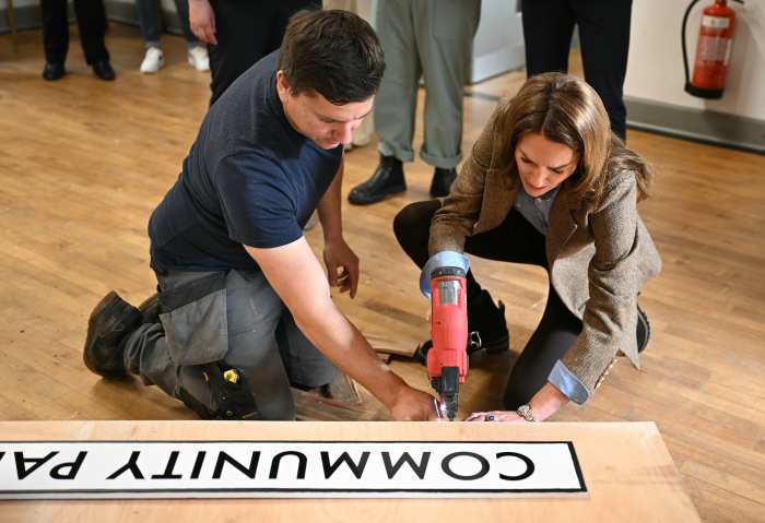
Catherine, Princess of Wales uses a nail gun as she helps to construct a sign for a Community Pantry, during a visit to Aros Hall, a local community hub on April 29, 2025 in Tobermory, Scotland.
“Look at her go!” one royal watcher wrote on X after seeing the now-viral photos.
Another user said the princess is “one of those women who seem like they can do just about anything.”
“She is definitely all that!” someone else applauded.
*+*, .m-detail–body>*+*, .m-detail–disclosure>*+*{
margin-top: 0;
}
p {
margin: 1em 0;
}
/*** Font size ***/
.m-component-detail-teaser .m-detail-teaser–content-body, .m-detail–body, .m-detail–disclosure{
font-size: 1.2rem;
}
/*** inline h tags ***/
.m-detail-header–content h1:not(.h-isolated-styles *){
}
.m-detail–body h2:not(.h-isolated-styles *){
}
.m-detail–body h2.m-longform-gallery–title:not(.h-isolated-styles *),
.m-detail–body h2:not(.h-isolated-styles *):last-child,
.m-detail–body h2.m-toc–title:not(.h-isolated-styles *){
}
.m-detail–body h3:not(.h-isolated-styles *){
}
/*** embeds ***/
.mm-embed–embedcode .m-embed–custom-element{
text-align: unset;
}
/*** related cards ***/
.m-embed-card{
margin-bottom: 20px;
}
.mm-card–type-list.mm-card–embedded .m-card–header-text{
font-size: 1.25rem;
}
/*** commerce buttons ***/
div.m-commerce-cta {
margin-bottom: 20px;
}
/*** inline ads ***/
.is-exco-player~.m-in-content-ad-row,
.is-detail-page article .m-in-content-ad-row {
position: relative;
padding-top: 20px;
padding-bottom: 20px;
border-top: 1px solid #ccc;
border-bottom: 1px solid #ccc;
margin-bottom: 20px;
}
/*
article .m-in-content-ad:not(.is-exco-player){
display: block;
}
article .m-in-content-ad-row phoenix-ad{
position: sticky;
top: 0;
}
article .m-in-content-ad-row.mm-in-content-ad-row–in-content{
min-height: 90px;
}
*/
.is-detail-page article .m-in-content-ad-row::before {
content: “Content continues below”;
font-size: 14px;
display: flex;
padding: 5px;
position: absolute;
top: -21px;
background-color: #fff;
color: #777;
justify-content: center;
}
/*** bottom ad ***/
.is-detail-page aside.m-in-content-ad-row[data-ad-group=”below_content-0″]{
padding: 0 0 20px 0;
}
/**** Rich Lists ****/
.has-custom-styles h1.m-heading.mm-heading–flanking::after, .has-custom-styles h1.m-heading.mm-heading–flanking::before, .has-custom-styles h2.m-heading.mm-heading–flanking::after, .has-custom-styles h2.m-heading.mm-heading–flanking::before, .has-custom-styles h3.m-heading.mm-heading–flanking::after, .has-custom-styles h3.m-heading.mm-heading–flanking::before, .has-custom-styles h4.m-heading.mm-heading–flanking::after, .has-custom-styles h4.m-heading.mm-heading–flanking::before, .has-custom-styles h5.m-heading.mm-heading–flanking::after, .has-custom-styles h5.m-heading.mm-heading–flanking::before{
display: none;
}
.has-custom-styles h1.m-heading.mm-heading–flanking, .has-custom-styles h2.m-heading.mm-heading–flanking, .has-custom-styles h3.m-heading.mm-heading–flanking, .has-custom-styles h4.m-heading.mm-heading–flanking, .has-custom-styles h5.m-heading.mm-heading–flanking{
margin-bottom: 1rem;
}
@media only screen and (min-width: 675px) {
/*** NL button ***/
.m-flex-nav–right-engagement{
display: block;
padding: 10px;
}
}
@media only screen and (min-width: 675px) and (max-width: 1239px), print{
@supports (display:grid){
}
}
@media only screen and (min-width: 1240px) {
.l-grid:not(.lm-grid–has-rightrail){
grid-gap: 40px
}
.m-sub-navigation.m-component-stack.mm-component-stack–is-stacked .m-sub-navigation–container{
padding: 0;
width: 1100px;
}
/*** main body content ***/
.lm-grid–with-right-rail .l-grid–content-body {
width: auto;
min-width: 760px;
}
.lm-grid–with-right-rail .mm-detail-header–image-size-inline .m-detail-header–content{
width: auto;
min-width: 760px;
padding-top: 0;
}
}
@media only screen and (min-width: 1240px) and (max-height:1049px){
}
@media only screen and (min-width: 1680px) and (min-height: 1050px){
}
@media only screen and (min-width: 1680px) and (min-height: 1050px){
@supports (display:grid){
}
}
]]]]]]]]>]]]]]]>]]]]>]]>
]]]]]]>]]]]>]]>