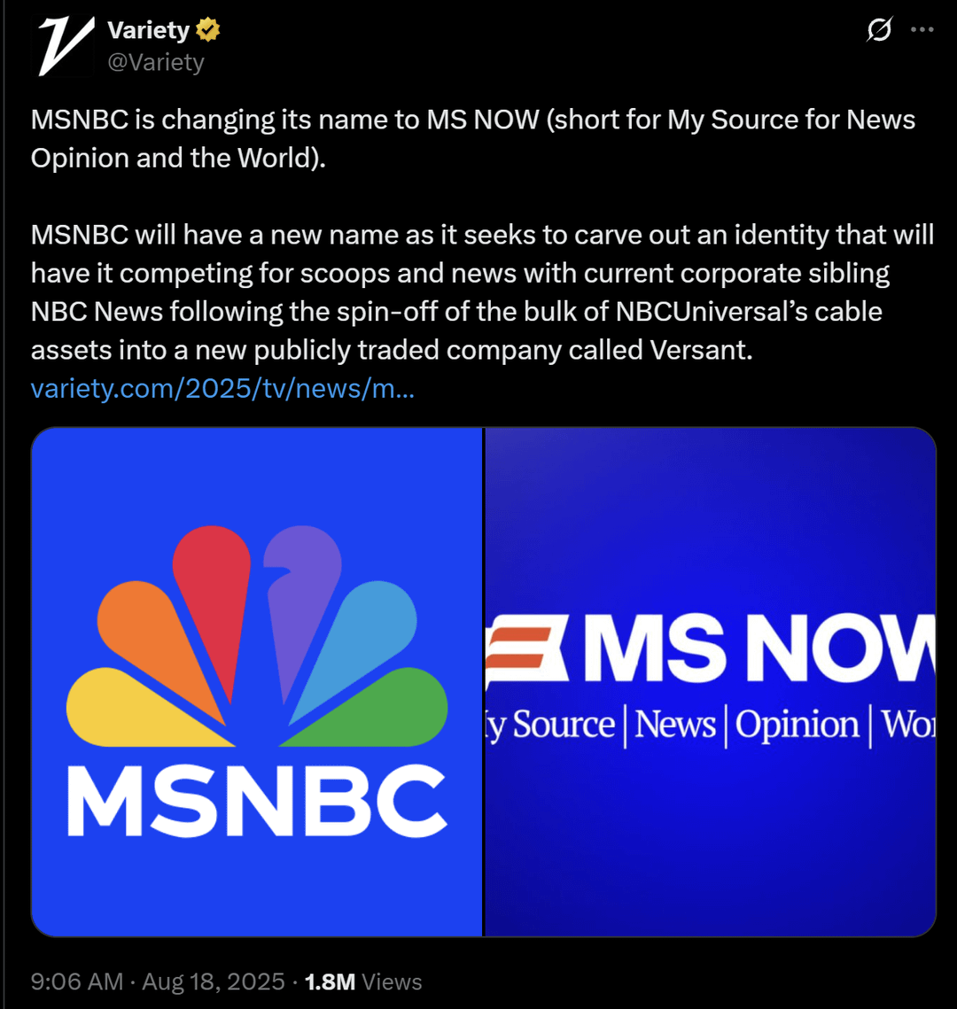


MSNBC Rebrands as “MS NOW,” Accidentally Looks Like a Multiple Sclerosis Awareness Campaign
Posted by Classic-Carpet7609

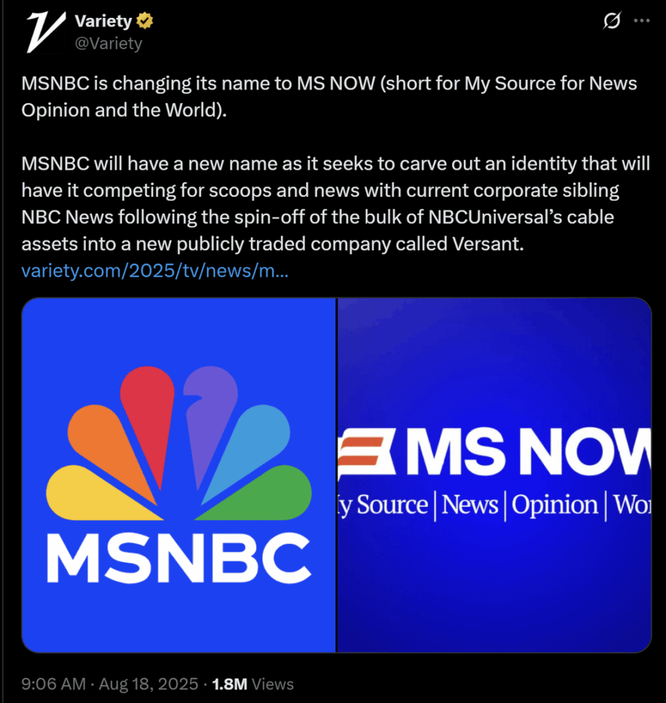
MSNBC Rebrands as “MS NOW,” Accidentally Looks Like a Multiple Sclerosis Awareness Campaign
Posted by Classic-Carpet7609
22 Comments

Thank you for making me laugh. I have a headache and it hurt me deeply but I don’t blame you
Reminds me of:
https://preview.redd.it/rqgj4tw2mvjf1.jpeg?width=735&format=pjpg&auto=webp&s=937723f1d2c13b1d7480b1c3a5c9ff0e12211bd9
Remember guys: a company got paid a lot of money to come up with that awful name, awful logo, and awful slogan.

The rebranding really sounds like something Jack Donaghy would come up with.

The gay intern in the marketing department while this was being presented
I thought is was her name, like Miss or Mrs
Moe: This thing can MS in 40 seconds.
Homer: But I want MS NOW!
Wow.
I didn’t think anyone could beat HBO when it came to a horrible, needless rebranding of an iconic brand but somehow MS Now truly takes the lead.
Oh was the rainbow too triggering? 🙄
“Competing for scoops”? Who tf is writing over at Variety
It really does look like KMS NOW.
Also looks like an old Microsoft program, like MS Paint (logo could have been designed in MS Paint, too)
This has gotta be a nepotism hire because what the fuck is this graphic design and how did it get approved
My wife passed from complications with MS. So I say great, don’t change it. Raise awareness by accident.
I’m guessing that dogshit logo-thing and color switch are an attempt to kiss up to the nationalist right wing. Not cute
and it looks like a logo for MS awareness on the side of the MS
I know what news is
I know what opinion is
What is world?
Rebranding is expensive, confusing and rarely successful. I rest my case.
It’s such a classic needless corporate rebrand. Idiotic. But I guess that’s par for the course with MSNBC
What do we want?? Multiple Sclerosis!!! When do we want it?? Now!!!